What does your car’s badge mean? Interesting brand logos explained

Recognisable branding is cornerstone to commercial success, and in few industries is this truer than automotive.
Every car brand comes with its own story and design philosophy, and the creation of the logos and badges fitted to its cars often encapsulates these.
We’ve collected some of the most interesting and storied car badges in history.
Hyundai
Kicking this list off is one of the cuter backstories for a car brand logo. Ostensibly just a slanted and stylised ‘H’ within a ring, Hyundai’s badge design actually carries a larger ethos of the business.
Squint hard enough and you might just make out the shape of two people shaking hands. Hyundai says its logo depicts the relationship between a company representative and satisfied customer.
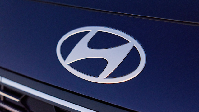
Look into it further and the rightward slant of the ‘H’ also signifies movement towards the future and innovation. It makes sense when you consider the South Korean translation for ‘Hyundai’ is ‘modernity’.
Audi
A venture formed during a time of economic uncertainty, Audi’s four-ring badge depicts the unification of four carmakers in Germany in 1932.
Audi, DKW, Horch and Wanderer – each represented by a ring – are quite literally tied together in unison on the badge of what is now known as Audi.
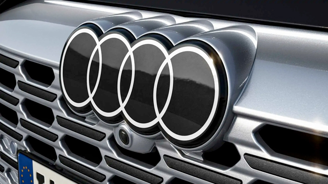
The logo may have undergone different colours, two- and three-dimensional effects, and finishes over the years, but has remained fundamentally the same and still denotes the strengths of multiple companies combining into one.
Toyota
It may look simple, but there’s a lot going on in the design of Toyota’s Japanese brush art-inspired badge.
The logo’s three ovals are intended to signify company trust, company heart and global reach. Look a little more closely, and each letter of ‘TOYOTA’ can also be made out in the way these ovals intersect.
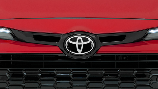
Furthermore, slight details of a steering wheel can also be seen in the overall design.
Tesla
The newest brand on this list, American EV specialist Tesla – named after Nikola Tesla, ‘The Wizard of Electricity’ – has fully embodied brand philosophies within its badge
Appearing at first glance as a fancy ‘T’, the Tesla logo actually stylises a cut-out of a cross-section of an electric motor – an integral part of making an electric car operate. Forming the ‘stem’ is a rotor pole, with a stator forming the curved top section.
Originally placed upon a shield at its 2004 creation, the ‘T’ of the Tesla logo has since ditched the crest and moved to be a standalone design element.
Alfa Romeo
A combination of Milan, Italy’s coat of arms and an ancient interpretation of a mythical snake known as ‘Biscione’, Alfa Romeo’s badge is the most bizarre on this list.
Packed with (some potentially sinister) history, Alfa Romeo’s badge quite literally depicts a man being devoured whole by the fabled serpent. Many say it is symbolic of a bronze snake statue gifted to the city around the year 1000, others that it represents power and loyalty, and some that it is symbolic of religious conquest in the region.
The Alfa Romeo has undergone various updates over its 116-year existence, but what still remains is the coat of arms and a man-eating snake.
Subaru
Translate Subaru into Japanese and you get ‘unite’ or ‘to govern’, and that’s just what the brand’s badge depicts.
Comprising six silver stars backdropped by a gradient of blues, the design symbolises five smaller brands coming together under a sixth and larger one which represents Fuji Heavy Industries. Combined, you get Subaru.
The brand says the oval represents the earth, but most interestingly is perhaps that ‘Subaru’ is also the Japanese name for the Pleiades star cluster (which forms part of the Taurus constellation). With a bit of creative liberty, you can kind of see the star cluster in the arrangement of those in Subaru’s badge.
Volvo
Despite often being mistaken for the male sex symbol in biology, Swedish marque Volvo’s logo actually has its roots in chemistry and mythology.
Go back a cruisy 5000 years, and the alchemical sign for iron (an element heavily used in the production of steel) and you’ll see what Volvo’s founders were getting at.
In addition, the symbol was also used by the Romans for Mars, representing strength and resilience.
Ferrari
Okay, you might not see this badge in the metal too often, but Ferrari’s ‘prancing horse’ logo has its own interesting backstory.
It’s said that famous Italian WWI fighter pilot Francesco Baracca painted a red horse onto every plane he ever flew. Following his death, his squadron honoured him by doing the same but with black paint.
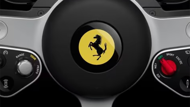
Tradition caught on when Barraca’s family met Enzo Ferrari and told him the story, compelling him to add the black horse to all Ferrari models thereafter.
Backgrounded with canary yellow – the colour of Modena, Enzo’s hometown – Ferrari’s prancing horse represents courage, command and passion, and is one of the world’s most recognisable and interesting car badges.


